How to use colors to set the mood of a room
It is now well known that colors can help to evoke certain emotions. But how exactly do colors affect us? Which colors are particularly suitable in which rooms? And how can you bring more color into your four walls without much effort?
Calming, stimulating or inspiring
Certain rooms are meant to perform certain tasks and, accordingly, these rooms are meant to promote certain states of mind. A bedroom, for example, is primarily used for sleeping, which is why soothing shades should also be used here. The bathroom should also be first and foremost a space to relax, so here, too, offer colors that convey tranquility. In the study, on the other hand, such shades would be completely out of place – after all, you want to get to work there motivated and energetic, not sitting tired in front of the computer. So, the first thing to do is to look at which colors go with which rooms.
Common rooms: living room, hobby room
In the living room and hobby rooms you want to enjoy your free time – so relax, but also get active. The ideal colors for this are all inspiring tones, so mainly yellow, orange or more muted reds. In order not to overdo it with the energy and thus to really allow calmness to set in when relaxing in the evening, you should make sure to either use the colors mainly as accents or to combine them with other, calmer or neutral colors, for example with white, green or blue.
If your hobby room is primarily used as a workout space, be a little bolder and use bright reds as well – it will give you strength and motivate you to work out harder.

Rest rooms: bedroom and bathroom
The ultimate calming color is blue – like the wide sky or gently swaying water. Studies have shown that people feel significantly calmer when they spend extended periods of time in blue rooms. However, blue also has a cold effect, which is why a room entirely in blue can sometimes feel shivery – especially in the bedroom or, even worse, in the bathroom, not ideal. So if you want to use blue for these rooms, it’s best to combine it with a second, warmer color, such as yellow.
Another soothing color is purple. By mixing blue and red, the color can also be mixed warmer or colder, depending on your taste, and thus soothe without conveying coldness.
Finally, of course, there would be greenery – like an idyllic forest or a meadow full of lush grass swaying in the wind. Green reminds us of nature and like a trip to it, it helps us relax and find our center. Green mixed with blue, such as petrol or turquoise, makes the color a little cooler, but also a little more soothing. Both colors are therefore also ideal for bedrooms and bathrooms.
Just do not forget about the bedroom that you may not always want to sleep here. A small spot of red in all the blue, green or purple can specifically stimulate the mood for this.
Children room
Children’s rooms usually fulfill several functions: Children should play and do their homework there, but also sleep well at night. Thus, the most important thing in the color design of the children’s room is the variety of color to emphasize all these moods. For example, hang an orange picture on the wall your child sees from his desk to motivate him while studying, but cover his bed with green or blue bedding to ensure a restful night’s sleep. The carpet, on the other hand, could be green or purple to create a positive but also not too exciting mood while playing.

For meals: Kitchen and dining room
The kitchen and dining room is all about one thing: preparing and enjoying delicious food. Red stimulates the appetite (which is why so many restaurants are decorated in red), making it the ideal color for these rooms. But beware: if you’re currently on a diet, eating in a red room might slow things down a bit.
Anteroom
The vestibule is the first room you see when you come home and your guests enter when they visit – and we all know: A friendly welcome lifts the mood. Therefore, in the vestibule, go for bright, cheerful colors, for example, a bright yellow or orange.
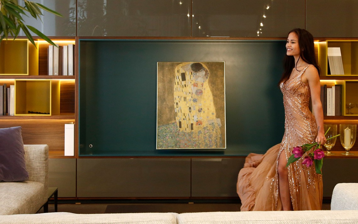
Set color accents with Heat4All ICONIC infrared heaters
Now that you’re the expert at setting colors, you’ll probably want to put what you’ve learned into practice right away – and don’t worry, you don’t have to repaint all the walls right now. Often it is enough to color a room with a few new furnishing elements, for example, curtains, pillows or even Heat4All ICONIC infrared heaters. For example, our decorative glass heaters are available in eight chic standard colors and can be printed with any other color upon request. Of course, you can also use one of our picture or glass picture heaters and choose a motif with a special color mood.